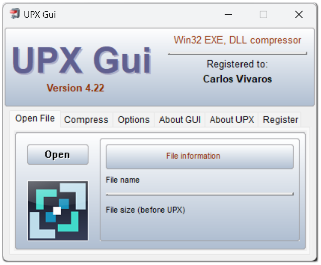
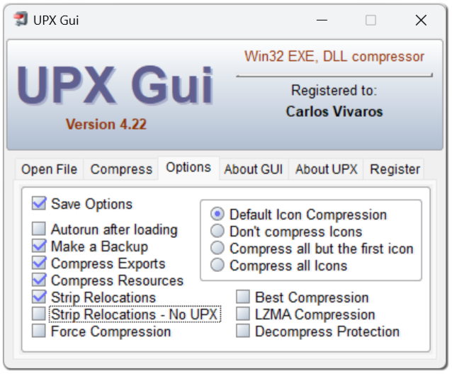
The author of this package is Alexander Karpinsky aka homm. The package contains a set of controls with an extremely beautiful appearance (with "live" buttons in the style of "fused metal"), these visual elements work very quickly, up to the use of MMX for graphics acceleration. Of course, using this set of components slightly increases the size of the application (from about 20K extra). But sometimes this increase in size can be justified by a significant improvement in appearance, making your development more competitive in the eyes of users spoiled by beautiful Windows interfaces. Also important is the fact that the look of the interface will be the same "cool" regardless of whether XP themes are included or not. It doesn't even depend on the version of the operating system, and it looks just as attractive in Windows 95.
Seduced by the appearance of these controls, I also decided to have a hand in the implementation of this package. I have developed a special migration module ToGrush.pas, which allows you to significantly simplify the transition to using this interface from the usual boring appearance. Now it is enough to add a link to this module to the end of the list of used modules, and after recompilation, almost all controls take on a new look. Moreover, if you enclose this addition in brackets {$ IFDEF USE_GRUSH}, ToGrush {$ ENDIF}, now the presence of the conditional compilation symbol USE_GRUSH will determine whether this package is used, or the controls retain their standard interior. This allows, in particular, to quickly compare the size of the application in the case of using and not using a package, or quickly rebuild the application for the case of the standard interface, if the application suddenly began to behave incorrectly, and you suspect that this is the package (although this, of course, is hardly the case). And, of course, this allows you to very quickly switch to a new interface without completely redesigning it for new controls.
At the same time, there are a number of peculiarities associated with the absence of some standard controls in the GRushControls package. For example, it does not have a toolbar. This visual element, however, can be easily imitated by creating a panel with buttons (fortunately, the buttons in the package under consideration can contain both a picture and a text).
In the ToGrush module, the toolbar construction function actually takes over the creation of an analogue of the toolbar control according to this scheme: a panel is created and buttons are placed on it. An important point is that you can no longer use system images for the control bar icons, and images whose width differs from the height, as well as images from the image list. In this case, for example, MCK generates such a code to create a ruler, in which the image descriptor is passed to the NewToolbar function as a parameter. / In any of the other cases, in the first call to NewToolbar, 0 is passed in place of this parameter, and images are added later, and as a result, the NewToolbar function from the ToGrush module cannot associate icons with the / buttons.
I even went to make changes to the KOL modules, KOLadd and the MCK package so that the transition to GRushControls can happen without any problems in the case of using MCK. Namely, the TEdgeStyle, which determines the appearance of the panel border, has been enriched with the esTransparent and esSolid values. Typically, these styles are no different from esNone (and correspond to the absence of a visible indented or extruded border). In the case of using GRushControls through the ToGrush transitional module, this style is used to create the previous (not in the GRushControls style) panel (in the case of esTransparent, such a panel is immediately made transparent) and again, without selected borders. The fact is that nested panels are often used to group controls, but their borders or fill should not make them visible against the background of parent panels or shapes.
In addition, I moved the ShowQuestionEx function and the ShowQuestion and ShowMsgModal functions that use it from KOL.pas to the KOLadd.pas module, and added the above reference to the ToGRush module in conditional compilation brackets to the USES list of the KOLadd module. Thus, dialogs created by these functions will also automatically use the GRushControls package if the USE_GRUSH symbol is defined in the application. A similar link to the ToGrush module has also been added in the KOLDirDialogEx module, so this dialog for quick directory selection now uses the GRushControls style, if it is defined for the entire application.
Example of an application with Grush Controls:

